

Medieval London Map
A look into the past with the Medieval London Map
 Our post about An Historical Map of York, published by The Historic Towns Trust, has been a consistently popular read here on the blog. Our latest project for the Trust is the Map of Medieval London: the City, Westminster & Southwark, 1270 - 1300.
700 years is a very long time ago, and most of us are probably a little hazy about that period in history. To put the map into context, here’s a brief summary of what was happening in England in the late 13th century.
Barbaric times
The Plantagenet kings were on the throne, and Henry III died in 1272. Prince Edward was abroad taking part in the last major Crusade and was proclaimed King Edward I in his absence.
Continuing his military exploits when he returned home, Edward defeated Llewellyn, the king of the Welsh, and annexed Wales to England. He made his young son the first ‘Prince of Wales’, a title still given to the eldest son of the monarch.
He also subdued the Scots by capturing Berwick, the largest and most important town in Scotland. As a sign of his domination he moved the Scottish crown jewels and stone of Scone, used for centuries in the coronation of Scottish kings, to Westminster Abbey.
These were barbaric times - to discourage the Welsh and Scots from uprising Edward introduced the punishment for treason of hanging, drawing and quartering.
A familiar city
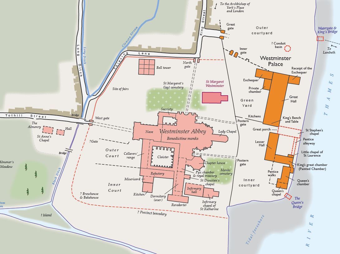
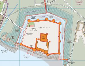
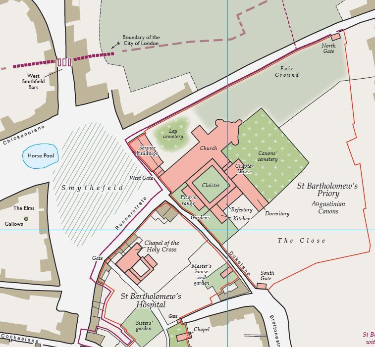
By 1300 the population of London was about 80,000, and it was by far the largest city in England. Looking at the map, at first sight what is surprising to modern eyes is the sheer expanse of green, showing gardens, open land and pasture. And then the realisation that all the pink areas, in many cases several on a street, are churches and chapels.
But perhaps even more surprising is that a time traveller, dropped down into medieval London, would not have too much difficulty orienting themselves. You see London Bridge crossing the Thames, with the Tower to the east, and to the west St Paul’s Cathedral and Westminster Abbey. The Bishop of Lincoln’s Inn is shown on Holeburnstrete, and running parallel to the river are the familiar-sounding La Straunde and Fletestrete.
The reverse of the map - daily life in medieval London
The whole reverse side of the map is packed with colourful illustrations and information, including the development of Westminster, and of Lambeth and Southwark on the south bank.
 A medieval A-Z includes Billynggesgate and Smythefeld markets, and street names in 13th century vernacular, some of which are still understandable to us today, such as Fancherchestrate and Garscherch (Gracechurch) Street.
The life of Archbishop Thomas Becket, a Londoner born and bred, is outlined by one of the historians who have compiled the map. Becket was murdered in Canterbury Cathedral in 1170. Even by the violent standards of the time this was a deeply shocking event, and he was declared a saint three years later.
William FitzStephen was present at the murder and wrote an account of Becket’s life. He prefaced this with observations on many aspects of life in the city, describing its daily routine, commerce, schools, Christian worship, summer and winter games, and much more. His vivid descriptions are featured on the reverse of the map, and add colour and life to the mapped streets and buildings of the capital.
A fascinating resource for all lovers of history, and a reminder of just how far back the city’s roots reach, the Medieval London map costs £9.99 and is available from bookshops and online book retailers.
For an alternative modern twist on a map of London see the London National Park City map.
Read An Historical Map of York.
Dennis Maps is one of the leading map printers in the world, producing more than two million maps and charts every year. We offer comprehensive pre-press services, large format print solutions using both large format litho printing and large format digital print technologies, plus specialised map folding and map finishing techniques.

Large Format Poster Printing

The process of printing a large format poster
It appears in so many different environments - in shopping centres, on the wall at your child’s school, at sporting events, available at the end of an Open University television programme. Whether it’s intended to advertise a business or educate, the large format poster is undoubtedly an eye-catching means to attract attention and stick in the mind of the observer.
Once prohibitively expensive for many uses, advances in printing technology mean that today large format litho printing has become easily affordable. And at the same time the quality has improved out of all recognition.
The larger option

This is a very specialised form of printing that requires all components - paper, plate setter, printing plates and printing press - to be larger. It’s a process that our expert and uniquely experienced staff relish and handle with ease.
At Dennis Maps our KBA Rapida 162a large format litho printing press prints a number of sizes from A4 up to our custom size of 1050mm by 1485mm. The posters are printed on a hardwearing, matt-coated 115gsm paper that is FSC© accredited (as is all the paper we use).
The print produced by our machine is very high quality, and fine detail can be accurately reproduced in up to six colours. For large volumes we can print up to 10,000 sheets per hour.
How a large format poster is printed
In the simplest possible terms the image is achieved through a chemical balance of vegetable-based inks and water. The image areas of the printing plate repel the water while receiving the ink. The non-image areas of the plate are water-receptive so that the ink is prevented from adhering, while it adheres to the image areas.
Finishing your large format poster
Your finished poster can be delivered flat, rolled in tubes, and one of our unique selling points is that we can fold the poster down to an easy-to-handle size. Our biggest poster can be folded down to A4 size, which is easily transportable.
 We can even source and customise the presentation boxes for your large format posters, pack them with tissue paper and stickers, and send them direct to your clients.
Next steps
Now you understand a little about large format posters we bet you’ll start seeing them everywhere! And do get in touch with us here at Dennis Maps if you’ve been inspired to include a large format poster in your next promotional campaign or at an upcoming trade event.
Don’t worry if you’ve never been through this process before. We can advise you on every stage of the process, from finalising your design and supplying your files, to approving your artwork and checking your proof.
At Dennis Maps we love to think big!
You might also enjoy reading: Digital vs Litho Printing
Dennis Maps is one of the leading map printers in the world, producing more than two million maps and charts every year. We offer comprehensive pre-press services, large format print solutions using both large format litho printing and large format digital print technologies, plus specialised map folding and map finishing techniques.

Ordnance Survey Map Symbols
OS Map Symbols - Unlocking the Code
A map is a graphic, two-dimensional visualisation of the world around us. The first Ordnance Survey (OS) map was published in 1801, but the first OS map symbols did not appear until 1886, when they were used to illustrate trees and vegetation.
Nowadays OS maps use a wide variety of symbols to help us represent (and make sense of) the world around us. OS symbols help the map reader to understand what appears on the map and are a useful guide to what you can expect to see when you’re out and about exploring the UK.
They can represent an environment in extraordinary detail. For example, they can show whether a piece of woodland is composed of deciduous or coniferous trees, and reveal the character of the ground you will cross - very useful to avoid muddy and marshy areas on your walk.
Why use map symbols?
OS maps use symbols that label real-life features and make the maps easier to understand. With so many features on an OS map, there just wouldn’t be enough space to label everything with text, meaning the map would become very cluttered and difficult to use.
Using symbols on a map can be a clever way of avoiding this. They can be small pictures, letters, lines or coloured areas to show features like campsites, pubs or bus stations. If you look closely at a map, you will see that it is dotted with these symbols throughout.
You will find a legend or key printed at the side of every map that lists all of the symbols used. Even if you know the area well, you may even discover features on the map that you’ve never realised were there when you passed close by on foot or by car!
Different kinds of symbols
OS map symbols are used to represent three basic types of information, known as point data, line data and polygon data.
Point data is exactly what it says
It is a single location point within the map. For example, this could be a car park, a viewing point or a trig pillar. You can read more about trig pillars here. These are usually represented by the following shapes or symbols:


Line data
This is used to represent symbols containing lines, such as:


Polygon data
This is used to represent specific area features within the map, such as water, woodland or sand. These areas are then usually filled with specific colours to differentiate them and help them to be identified easily.


Updating map symbols
 OS symbols are refreshed regularly to reflect the changing environment in which we live. For example, in 2015 six new symbols were introduced for electric car charging points, art galleries, solar farms, skateboard parks, toilets and kite surfing areas.
These new symbols were chosen by a competition that was open to members of the public to design and submit their ideas for the symbols.
An OS map symbol is the easily understood map language that will guide you through every walk, bike ride or run that you go on. All of the features you will see when out and about are on your OS map, and the symbol will help you with your map reading and to understand what your map is telling you.
And if you're planning a walk this post on how to plan a walk with an OS map is a useful read
Now you know more about OS map symbols, perhaps you could come up with an idea for a new map symbol ready for when the next refresh takes place?

Map and Map Symbol images are subject to © Crown copyright. All rights reserved.
Why not produce a wall map of your favourite area? Wall maps are a great way of portraying many different themes and make great gifts!
Dennis Maps is one of the leading map printers in the world, producing more than two million maps and charts every year. We offer comprehensive pre-press services, large format print solutions using both large format litho printing and large format digital print technologies, plus specialised map folding and map finishing techniques.

HARVEY Maps
An Interview with HARVEY Maps CEO Adam King
Adam, you're a part of the HARVEY Maps team, based in Doune, Perthshire in Scotland. It’s been an interesting journey for the company - what’s the story behind HARVEY Maps?
 The story behind HARVEY Maps is indeed a remarkable one. The company was founded in 1977 by Susan and Robin Harvey when they identified a need for clear and detailed mapping for the sport of orienteering.
Over the 40 years or so since, the company’s focus has evolved to cover all aspects of providing maps for recreation in the outdoors, and the range on offer today is truly outstanding.
In 2019, our team completed a long-term goal of mapping all of Scotland’s Munros (mountains over 914m) and our latest book, The Munros, The Complete Collection of Maps, is in part a celebration of this and the journey the company has been on since 1983 when the first Munro was plotted.
On a personal level, my HARVEY journey is no less remarkable. It’s nearly 10 years since I joined the team as a cartographer, and this year sees me step up to Susan’s role as CEO as she begins her well-earned retirement. They certainly will be very big shoes to fill!
Tell us a little about the type of maps that you make
Our maps cover outdoor activities such as walking, running and cycling. They are designed to aid the user in the exploration of the outdoors and withstand the rigours of the British weather.
As such, they are relatively large scale with all the detail a user needs to navigate and map read safely. Imagine you’re planning a good long walk around Snowdonia, or the Peak District, and you need a map - then we make maps for you.
We also make maps of National Trails and Long Distance Routes, such as the South West Coast Path, or Cotswold Way. These are unique because we break the map sheet down into panels to cover the highlighted route, meaning the walker only has to carry one or two maps to have the route covered in its entirety.
What are your most popular products?
 The Cuillin, our Superwalker map (1:25,000 scale) of Skye, is very popular, and is renowned amongst walkers and climbers as the must-have map when tackling the tricky, but beautiful, Cuillin Ridge.
In our Trail Map series, the West Highland Way, South Downs Way and Pennine Way maps continue to be popular and our offering in that series is always growing.
The British Mountain Map of the Lake District (1:40,000) always sells well and our most recent map series, the Ultramap (1:40,000), has proven very popular – our customers love how small and convenient the finished map is without compromising on the detail!
Each of our four primary map series offers the customer something different. But we don’t just make maps! The Mazzle, our take on the map jigsaw puzzle, was first produced in 1980 and its popularity remains extremely high to this day.
I believe that HARVEY Maps’ printed maps have some very unique features - what are they, and why are they important?
All of our maps are designed with the user in mind. We show only those features that are useful when using the map outdoors, allowing us to remove much of the clutter that is irrelevant and confusing to the walker, such as parish boundaries.
A good chunk of our cartographic focus is spent on the representation of relief and the method by which we show contour lines is certainly unique. The contour interval on our maps is 15m, with an index contour line (every fifth contour line is thicker than the others) at 75m intervals.

Although this interval may seem unusual to people who are accustomed to contour lines every 10m, the resulting map is much clearer, especially in steep areas. Our contour lines are also coloured differently. Where the ground is predominantly exposed rock the contour lines change from brown to grey.
This symbology has proven very popular as it gives the user an added visual aid when they are using the map. On the British Mountain Map series, we go one step further and use layer colouring in addition to contour lines to depict relief. The effect this has on these maps is fantastic, and when viewing the map sheet as a whole, it becomes very easy to distinguish between valleys and mountain tops.
We also use a scale of 1:40,000 on some of our products. For sheet maps, this scale offers the perfect balance between map coverage and the detail we can show on the map.
For us, it is always about finding the best cartographic solution to ensure the map is clear and easy to read as well as pleasing on the eye. As the majority of our team are themselves walkers, we continue to refine our methods so that we can be sure each map that goes to print is ready to be used outdoors.
How do you resolve the challenge of using the synthetic Polyart material with helping to protect the environment?
The maps are printed on Polyart, a material that feels a lot like modern banknotes, and as such they are built to last. It is indeed a synthetic material, but as the maps are designed to be tough, light and waterproof, we believe this is the best way to give outdoor enthusiasts a map that is long lasting, reliable, fit for purpose and that will not fall apart when the conditions become tricky.
The impact our products have on the environment is very much at the forefront of our business and we have taken positive steps to change our packaging and branding.
However, there is always more we can do to reduce our consumption of disposable and single-use materials and we continue to look for innovative and attractive solutions so that our products fit in with the environment they are meant to be used in.
What are the challenges, and rewards, of this kind of map making?

There are always plenty of challenges facing us at HARVEY. These range from recruitment to marketing and everything in between! Cartography is being taught less and less at higher education institutions nowadays and this may impact future recruitment strategies but we are in a very fortunate position as we have a great team of experienced staff already in place.
On the production side, it remains a challenge to keep our map data up-to-date. We continue to plot new data as well as reprint all of our other titles in cycles so there is always plenty of work available to ensure our maps accurately reflect what is on the ground.
It is a great privilege to be involved in making maps that people use outdoors every day and for me, the rewards far outweigh the challenges. Mapmaking is as much an art as it is a science and it has been extremely rewarding to be involved in creative work of this type.
The process of making a map from scratch is lengthy but when the finished printed map returns from Dennis Maps, the feeling of satisfaction and pride in what we have achieved is always the same. The rewards of this are plain to see when we receive positive user feedback on our products.
What developments do you foresee in mapping, both in the near, and far, future?
 It should come as no surprise that developments in mapping will be driven by the technology on offer now and in the future. The spectrum of mapping-related products is growing year by year. Although printed maps remain a large part of the public’s association with mapping, the move to augmented reality mapping apps (an interactive fusion of real world and computer world, such as walking route overlays on your device as you hold it up to the mountains in front of you) is a great example of innovation driven by technology.
For HARVEY Maps, keeping apace with technological change is in part a challenge but it is also exciting. It’s important that our data capture methods use future technologies efficiently (future developments in drone technology and legislation regarding their use, may be one example) but also that we get the most out of the data we already have.
Whichever way we pursue our own innovation in mapping, it is our belief that the basic principles of cartography should always remain. So long as we are making clear and detailed maps that are fit for purpose (whatever that may be in the future), then I am certain the future of mapping is a bright one.
All map images © HARVEY MAPS 2019
Follow these links to other interviews with our people, clients and suppliers:
Steve Burry (MD of Dennis Maps)
Dennis Maps is one of the leading map printers in the world, producing more than two million maps and charts every year. We offer comprehensive pre-press services, large format print solutions using both large format litho printing and large format digital print technologies, plus specialised map folding and map finishing techniques.

NACIS Cartographic Conference
NACIS - a North American cartographic community
 Steve Burry, the Managing Director of Dennis Maps, enjoys representing the company in the global cartographic community. In October he made a very exciting trip to the USA to attend the NACIS annual conference, and describes his experiences of this lively event:
What is NACIS, Steve, and why did you attend their conference in Tacoma, Washington State?
NACIS is the North American Cartographic Information Society. I attended the annual conference for the second time this year following a very enjoyable and informative experience in 2018.
I was made to feel so welcome as a first time attendee, and learned so much about what was happening in the North American cartographic community, that I decided to return this year.
What was your objective in attending?
![]() I wanted to build upon the knowledge I gained last year by attending as many presentations and events as I could during the three days of the conference. I was also looking forward to meeting up again with everyone I’d met in 2018 and to meeting some new people. The whole NACIS community is so welcoming that they’ve made me feel really at home as a visitor from the UK.
I wanted to build upon the knowledge I gained last year by attending as many presentations and events as I could during the three days of the conference. I was also looking forward to meeting up again with everyone I’d met in 2018 and to meeting some new people. The whole NACIS community is so welcoming that they’ve made me feel really at home as a visitor from the UK.
Everyone who attended the conference received a Dennis Maps delegate bag - what did it contain, and how was it received?
I decided to provide all of the attendees with a Dennis Maps delegate bag as a small thank you for the welcome I had last year. The bags contained a notebook, pen, lapel badge, post-it notes and a couple of printed map examples illustrating some of the different UK cartographic styles.
The bags seemed to be very well received, and it was very nice to see delegates using their notebooks and pens during the presentation sessions, and also to see a few social media posts commenting on the sample maps. The Great British Music Map seemed to be very popular!
It was particularly nice of the current President, Leo Dillon, to give a formal thank you at the annual NACIS banquet dinner. This was a nice touch and one that I very much appreciated.
What was it like being with a group of such amazing cartographers for three days?
 It was fascinating to be with such a great group. The NACIS community is a really knowledgeable and diverse group that comes from all parts of the US and Canada, and from all areas of the cartographic sector, from the US government, private commercial, academic, and artistic arenas.
Did anyone comment on you having made the journey from the UK to attend?
Some delegates were interested that I had travelled from the UK, and were also keen to learn more about the current cartographic community in the UK (British Cartographic Society) as well as Dennis Maps’ role as a leading service provider to this group.
You were asked by the previous NACIS President to give a presentation - how did it go down?
 I delivered my presentation, The Art of Map Printing: Colourful Reflections from Across the Pond, on the second day of the conference.
It was very well received, with a high level of engagement and interest from those attending. There were some interesting questions too, particularly around the possibilities and opportunities that digital printing offers, both now and in the future.
What was the most interesting thing you learnt?
There were so many interesting presentations it’s very difficult to select just one particular thing! The breadth of the subject matter was what impressed me. Whether that was artistic advice on colour hill shading by hand, a Spatial Analysis of Students in K-12 Education, or the mapping of the evolution and growth of the US during the nineteenth century.
What did the delegates think of Dennis Maps’ products compared to those produced in the US and Canada?
There was a definite interest in the different cartographic styles that were illustrated by the Dennis Maps samples, and it was fascinating that the UK style of having a printed map with a separate cover is virtually unknown in the US and Canada.
And real interest in the quality of the Custom Made digitally printed product and the possibilities that this high level of personalisation could offer to other printed maps.
Do you plan to go again next year? If so, would you do anything differently?
I do plan to attend next year’s conference in Minneapolis, and I’m already looking forward to meeting up again with the great people I’ve got to know. With a record number of 464 attendees at this year’s conference, you can only meet so many people in the course of three days, which is another great reason to return in 2020!
Dennis Maps is one of the leading map printers in the world, producing more than two million maps and charts every year. We offer comprehensive pre-press services, large format print solutions using both large format litho printing and large format digital print technologies, plus specialised map folding and map finishing techniques.
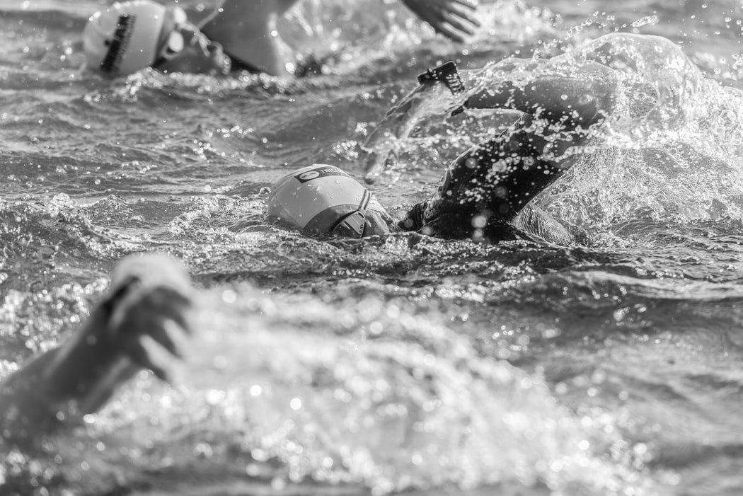
What's So Great About Doing a Triathlon?
The Triathlon - swim, run, cycle!
 Christian Coates (he's the one taking the photo in the image to the left), a CTP Operator here at Dennis Maps, has already told us about his unusual hobby of collecting trig points, and how cycling to work led to a passion for road cycling. He also takes his love of sports much further by competing in triathlon events, the fastest growing sport in the UK. Here he shares his experience of triathlons:
First of all, Christian, what does a triathlon consist of?
A swimmer, a runner and a cyclist were arguing about who needed the most stamina to compete in their chosen sport. So it was decided that they should combine all three, and that’s how the triathlon was born.
As the name suggests, it consists of three events, swimming, running and cycling, along with a fourth discipline, the transition between each of the three events. Depending on the type of triathlon, Sprint, Olympic, Half Iron or Ironman, it takes place over different distances, and takes from just over one to more than 17 hours to complete.
The swim is between 400 metres and 2.4 miles, the run from 3 to 26.2 miles, and the cycle ride from 16 to 112 miles. For the Olympic sport the distances are 1500 metres, 6.2 miles and 25 miles respectively. The stroke used for the swimming event is the front crawl, and this is the most challenging part.
Does it cost much to get started?
When you’re just starting out, you don’t need to spend too much. You’ll need a swimming costume or trunks, shorts and t-shirts, some trainers, and a bike and a helmet.
You do need to pay to enter events, though, and that can cost a fair bit. A full Ironman entry is £550, but local events only cost £30 or 40 to enter, and club membership is usually about £40 a month.
How do you build up to events?
 My first triathlon was in Midsomer Norton eleven years ago, when I didn’t even have my own bike! I borrowed a friend’s bike to do some training, but whilst training I got hit by a car. Despite that, I was hooked. I love the feeling afterwards when I know I’ve done well!
For a local novice, there isn’t really too much prep. You need to be able to swim, of course. Most people can cycle and if you’re not a good runner, you can walk some of the course.
It took me eight solid months of training to progress to Ironman. I would cycle 80 miles in an afternoon, run 10 miles later that evening, and swim 10k a week. I did suffer a bit though. I had dehydration for days, huge blisters on my feet, and terrible cramp on the inside of my ankles.
I wanted to complete the event in 14 hours, and actually completed it in 14.03 hours, so it was an amazing accomplishment.
I forgot my race shoes for one event, so I ran and cycled in my trainers. I ripped the trainers and my feet to shreds, but I did still manage to finish the event. The mental aspect is so important - you have to believe that you can do it.
Any advice or warnings for anyone thinking of embarking on training for a triathlon?
My advice would be to join a local club. It’s a solitary sport, so a club offers friendship and support. You will learn so much from other members.
Competing in triathlons can make you a better person, mentally and physically, but don’t put too much pressure on yourself and don’t get depressed by how long it takes to become good. With regards to your training schedule, the motto is Don’t Cram – Must Plan. Don’t put yourself in danger by pushing too hard.
What else would you like to achieve?

I now have started my Level 2 Coaching Diploma, which should be completed by May 2020, so I’m very proud to now be able to help train the next generation of triathletes on a one to one basis.
My colleagues Lewis Walker (Print Supervisor) and Simon Marks (Map Finisher) completed their first local event in August, and Dennis Maps are sponsoring the Frome Triathlon Club Junior Section.
Maybe I will do another Ironman event when my children are a bit older. My ambition is to compete is the Lanzarote event, which is the toughest in the world. I would love to do that one day.
Dennis Maps is one of the leading map printers in the world, producing more than two million maps and charts every year. We offer comprehensive pre-press services, large format print solutions using both large format litho printing and large format digital print technologies, plus specialised map folding and map finishing techniques.
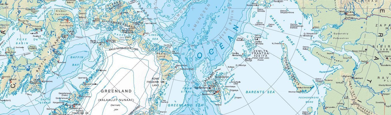
Greenland and the European Arctic Map
Greenland and the European Arctic map and climate change
 We are all well aware that the polar icecaps are melting, and the landscape of the Arctic is being changed forever. So it was an honour to work with the British Antarctic Survey (BAS) to produce the Greenland and the European Arctic map as a record of the present environment.
This is the first map of the Arctic region we have produced for the BAS, and the first time the region, including Greenland, Iceland and Svalbard, has been mapped in this way. We used our Koenig & Bauer Rapida 162a large format litho printing press, which uses six colours, to show the fine detail and geographical features of the area.
The lavishly illustrated reverse side of the Arctic map contains many colour images and text boxes explaining the climate change challenges faced by the region and the work being done to preserve this unique part of the world.
How important is the Arctic map?
The Arctic plays a vital part in the climate system of the Earth, helping to regulate global temperatures. But the effects of climate change are being experienced more rapidly and severely here than anywhere else. For the last 50 years it has been warming up more than twice as quickly as the rest of the world.
Sea ice has decreased by about a third over the last 30 years, and most sea ice is now less than one year old. In 20 years the Arctic Ocean could be almost free of sea ice during the summer. It’s essential we understand these changes, both for the benefit of the region, and for the consequences throughout the world.
Animals in peril
 The Arctic is home to animals such as the polar bear, the narwhal and walrus. The number of polar bears in the region is estimated to be between 22,000 and 31,000. Due to the loss of their habitat the population is predicted to decrease by 30% over the next 30 years. The World Wide Fund for Nature (WWF) has been working with governments and Inuit people to collect data on the polar bear population in an effort to conserve the species.
Indigenous People threatened by climate change
About four million people live in the Arctic, of whom 10% are Indigenous People, who over thousands of years have developed highly skilled and successful ways of hunting, fishing and foraging. The results of climate change such as melting ice and rising sea levels are threatening coastal settlements with flooding, while industrial expansion and pollution are damaging traditional cultures.

Plastic pollution
Research has shown that as a result of ocean currents bringing in plastic, the Arctic may have as much plastic pollution as seas closer to the more densely populated parts of the globe. More than 90% of fulmars, one of the main species of seabirds in the region, have been found to have large pieces of plastic in their gut. Microplastics can easily enter the food chain, and are particularly damaging to Indigenous People whose way of life relies heavily on hunting and fishing.
Visitor Guidelines
As well as fishing, reindeer husbandry and the extraction of valuable resources like oil, minerals and gemstones, up to one million visitors a year come to the Arctic. In order to encourage respectful, environmentally-friendly and safe tourism the Arctic map provides helpful advice on behaving responsibly towards its people, wildlife and the environment.
Greenland and the European Arctic Map - ‘Professional, precise printing’
Laura Gerrish, mapping specialist at the BAS, praised the ‘professional, precise printing’ of the map. ‘We are extremely happy with the final product,’ she said, ‘and the map is now being used by scientists, tourists and those with a general interest in the Arctic.
‘Our next two printing jobs are already lined up with Dennis Maps and we will continue to work with them to produce our high-quality products.’
We are delighted to announce that this map received a ‘Highly Commended Award’ at the recent British Cartographic Society Conference held at Ordnance Survey HQ.
Front Cover image by Hannah Gerrish.
If you're interested in the chillier regions of the world take a look at our other post about Sir Earnest Shackleton and his epic journey across South Georgia to rescue his fellow adventurers.
Dennis Maps is one of the leading map printers in the world, producing more than two million maps and charts every year. We offer comprehensive pre-press services, large format print solutions using both large format litho printing and large format digital print technologies, plus specialised map folding and map finishing techniques.

National Park City Maps by Urban Good
An Interview with Charlie Peel about National Park City Maps

We thoroughly enjoyed printing the ground-breaking London National Park City map for social enterprise Urban Good. The map illustrates the sheer amount of open space within the city - parks, woodland, playing fields, rivers, ponds etc - where you can head for some exercise and fresh air.
We’re now delighted to introduce Charlie Peel, the founder of Urban Good, to talk about the development of the project and its positive outcome.
Charlie, you established Urban Good CIC (community interest company) in 2016 - please tell us about the work you do.
With a background in large scale urban development and national policy I realised the value in working across and joining up architecture, landscape, engineering, planning and communication. I believed there was space in the built environment sector for a social enterprise that used design to make cities better, and could offer clients better value.
At Urban Good we provide research, graphic design and advice to architects, planners, developers, local authorities and community projects. But the project with enough excitement to get the ball rolling for Urban Good was the National Park City.
The London National Park City Map was your brainchild - how did you come up with the idea?
I remember hearing Daniel Raven-Ellison describe his vision for a National Park City quite early on in the campaign. Following the presentation I simply said that the concept needed one powerful image to sum it all up and communicate the idea in a matter of seconds: a map.
Without hesitation, Dan asked if I could make one. I said no... but I would try. It wasn’t until we had a working illustration, published in 2016, that I returned to Daniel with the challenge that ultimately led to the National Park City Map - ‘We’re gonna need a bigger piece of paper.’

What challenges and breakthroughs did you experience along the way?
As our first move we established a trusting and supportive relationship with Ordnance Survey, GiGL and the Greater London Authority. This opened up access to the accurate and powerful data that is the backbone of the London map.
The biggest challenge was to rip up the business plan once we learned that the data could only be made available to us if we offered the maps for free.
In just two years we have put 25,000 National Park City maps into the hands and homes of the public. Since initially crowdfunding the map, we rely on donations and a P&P charge that covers costs.
What mistake did you learn the most from?
With such a large format, re-drawn, vector map we were keen to tell the story of London’s diverse open spaces with subtle variations in pattern. While the majority of the map would be green, patterns could differentiate the different land uses - parks, cemeteries, woodland, nature reserves, sports fields and so on.
Very quickly, with the hundreds of layers of data, the use of these complex patterns made the file a challenge to print. We worked with Dennis Maps and Kodak to resolve the issues, but since then our map making skills have improved, and we specialise in creating lithographic prints.
How has the map been received?
 We are in the early stages of obtaining some more conclusive feedback via a short google form. This will help us learn what we can do better with the next edition. Anyone who has a copy of the map is welcome to tell us what they think.
Up until now we have relied on social media to take the temperature of opinions – and it’s overwhelmingly flattering. People really get the map and everything it sets out to celebrate and communicate.
I believe other cities are going to create their own ‘green map’?
Soon after London was a hit, we got the call from Amsterdam and published our first in a new series of Urban Nature maps. Now we are rolling out the series across UK cities with an initial aim of 10 cities mapped and released in 2020.
We have spent three years refining our craft and building our partnerships, and it’s great to be scaling up sustainably as a non-profit. Meanwhile we continue to support the National Park City Foundation, and will make a series of detailed London maps just like the Greenwich Map we published this summer.
Urban Good have published their Greenwich Map and Urban Nature Amsterdam Map this summer.
Tell us a bit about why you brought a film crew down to Dennis Maps this year?

We know people love our maps, but so few people have the chance to see what a modern, sophisticated map press looks like. They simply press cmd–P in their offices, and we wanted to show them just how hard it is to make the maps as great as they are!
For us the exciting part is how active and live the process is, with a team of people setting up, monitoring and adjusting the giant sheet-fed litho press. It was a great day filming Urban Nature Amsterdam being printed, and we’re excited to launch our film today. (See Video below)
What’s next for Urban Good and for you?
Dare I say it, our plans will see us printing many more maps with Dennis Maps, but some of the current proposals are still under wraps. We can, however, proudly share that the first of our UK series will be Newcastle Upon Tyne in the same folded format as London, Amsterdam and Greenwich.
We are working with some amazing non-profits too, to help them communicate their work around walking and green spaces in cities. It’s fun work and now it’s about picking the projects that can have the greatest impact.
All National Park City maps are available by postal order via Urban Good. If you would like to buy any of Urban Good’s unique maps please click on the links below:
If you would like to keep up to date with Urban Good's news please follow them on Twitter.
Images of Girl and Boy pointing at the map and Urban Nature Amsterdam Map © Paul Cochrane.
Urban Nature Amsterdam - Printing with Dennis Maps from Urban Good on Vimeo.
Follow these links to other interviews with our people, clients and suppliers:
Steve Burry (MD of Dennis Maps)
Dennis Maps is one of the leading map printers in the world, producing more than two million maps and charts every year. We offer comprehensive pre-press services, large format print solutions using both large format litho printing and large format digital print technologies, plus specialised map folding and map finishing techniques.

Tour de France Map 2019
UK edition of the official Tour de France Map
 When you’re as passionate about maps as we are at Dennis Maps every project is fascinating, and we work hard to make sure each detail is correct and perfectly finished.
And then once in a while a job comes up that perfectly matches a personal interest of one of the team. Only last month, Christian Coates, one of our CTP Operators, featured here on the blog talking about his hobby of road cycling.
This month we can reveal that we printed the UK edition of the official road map of the Tour de France, which was for sale with the event’s official guide.
Perhaps a little faster and longer than Christian’s usual rides, the race is France’s greatest sporting event, and we were delighted to be selected to produce this colourful map.
The Tour de France Road Map
 The front cover of the Tour de France map shows the dramatic setting of the Chateau du Haut-Koenigsbourg in the Alsace, built on top of a peak negotiated by the cyclists in Stage 5 of the Tour.
The route is shown in bright yellow. From the start - Le Grand Départ - in Brussels on Saturday 6 July, it progressed mainly through the east of France. The traditional sprint finish on the Champs-Élysées in Paris was on Sunday 28 July.
Two sections are shown in larger scale, a road map of Brussels, and the area around Pau, the most western part of the race.
Two keys can be found in the bottom left hand corner of the Tour de France map. One shows the symbols used along the route of the race to illustrate where each stage starts and finishes. Also illustrated are the types of stage along the way, and the transfers where riders are transported to begin the next stage in another location.
The other key relates to the geography of France, its roads, borders (national and départment) and inhabited areas.
The race took place over three weeks and covered 3480 kilometres (2162 miles). It included seven flat, five hilly, and seven mountain stages. Five of the mountain stages had mountain-top finishes, three more than 2000m above sea level. No wonder it was dubbed ‘the highest race in history’.
There was also one individual time-trial stage, one team time-trial...and only two rest days!
History
The first Tour de France took place in 1903 as a way of increasing sales of sports newspaper L’Auto. The paper’s chief cycling journalist suggested organising a six-day race all around France, and it generated so much interest that circulation of the paper doubled. It has been held every year ever since, with the exception of the two World Wars.
 The famous yellow jersey was introduced in 1919, the colour chosen because that was the shade of paper L’Auto was printed on. The yellow jersey is awarded after each stage to the overall leader of the race, and is presented to the rider with the shortest overall time at the end of the race. The colour has now become synonymous with the race and is used on its logo and throughout the promotional material.
Cycling fans consider the 2019 race as one of the most eventful and unpredictable they can remember. From hailstones, landslides, and the tearful exit of a rider to the humour of Sir Bradley Wiggins’ commentary from the back of a motorbike, it was an unforgettable three weeks.
The winner was Egan Bernal, the first Colombian to win the race, who at only 22 surely has a brilliant career ahead of him. His teammate and the defending champion, Welshman Geraint Thomas, described him as a phenomenal athlete, ‘born to go uphill fast’.
An attribute no doubt appreciated by Christian as he tackles the more modest hills of his favourite rides around Somerset and Wiltshire!
Yellow Jersey cyclist photo by Árni Svanur Daníelsson on Unsplash

Road Cycling Maps
What's so good about road cycling maps?
 In a previous and very popular post, Christian Coates, a CTP Operator at Dennis Maps, told us about his hobby of collecting trig points. Christian is now back to talk about another of his interests, road cycling, and how he uses road cycling maps.
What made you take up road cycling?
Simple - we couldn’t afford two cars! We lived on the outskirts of town and my wife needed the car for work, so I bought an old mountain bike for the four mile round trip to work.
Then I began arranging bike rides for the staff of what was then Butler Tanner & Dennis. The first one was in 2009 to Kilmersdon and back. Nine people went on that ride and we used old Ordnance Survey maps – before we even started printing them!
A colleague of mine had a road bike and did events called Exmoor Beast and Longleat Lionheart. I wanted to try this as well, so I changed my bike using Cyclescheme, which helps you save money and spread the cost of a new bike and accessories.
I got a Felt N85 Road Bike. It was totally different and I literally had to learn how to ride it, it was so difficult. In 2012 I did the Exmoor Beast, over the Quantock Hills and Exmoor.
What do you think the benefits are?
It’s great to be outdoors, and good for heart, lungs, body, mind and soul. It’s not just good for your physical health, it’s a form of therapy that helps you escape the stress and pressure of life and work, so it’s good for your mental health too.
What type of bike do you ride now?

I’ve had a Cannondale Liquid Gas SuperSix since 2012. I’ve used it for Ironman events and I call it my Iron Lady. I wouldn’t swap it for the world.
I also have a Fuji Norcom Time Trial bike that I plan to use next year, and a couple of others as well. My family all have bikes. We need a trailer to take them all when we go on holiday!
How do you use road cycling maps and OS maps when planning your route?
I use OS paper maps for preparation, I’m a big fan of the Explorer series. I will look at a map and choose an interesting place and then plan a route of how to get there. It’s old fashioned, but much more fun.
Some cyclists have Garmin watches and they download a map from their computer to their Garmin. But then they get absorbed in following the exact route rather then enjoying the scenery.
If I get lost, it’s not a big deal. I don’t want to keep checking a map and I’m lucky to have a good sense of direction. I do have a GPS watch, so I can cross reference if necessary.
What’s your favourite ride?
 I have a top three. First would be Portland Bill and Weymouth. The scenery is stunning and the cycling is great there.
Second would be what I call the Christmas Detox. It’s Frome – Radstock – Bath – Frome. It can be done as a novice ride with beginners, plus you can stop en route for some refreshments, so maybe it’s not such a detox after all!
Third would be jointly Stourhead Gardens, Longleat Estate, and Chew Valley Lake, such beautiful places. I use Sustrans Cycle maps to plot my route for some of these.
Keen cyclists always ask about your favourite hill. Mine would be King Settle Hill, leading to King Alfred’s Tower. It’s a 1 in 17 gradient, which is the hardest.
What events would you recommend to someone wanting to get involved?
There are hill climbs every month, and time trials along the Frome bypass. One of the most popular time trial routes for someone new who wanted to give it a try is around Mere and over the Deverills, 25 miles in all.
Personally, I do triathlons, which are swimming – cycling – running, and Sportives, which are road racing over a long, rolling route arrowed out in advance.
Any advice for people wanting to start road cycling?
Contrary to what you may think, it doesn’t have to cost much. Buy yourself a good new helmet, but then look on eBay for a secondhand bike. No need to spend a fortune – just enjoy it. Then when your family see you the fun you’re having, they will want to join in, and it can become a family pursuit.
If Christian has inspired you to get back on your bike see our post to help you take up cycling as a healthy and enjoyable pursuit.
If you're into cycling already you might be interested in our post about the Tour de France Map we printed.